 Table of Contents
- Best Sports & NFL Team DTF Designs 2026
- 1. Top NFL Team Color Palettes to Roll Out
- 2. Design Styles That Sell
- 3. Sunday Funday and Tailgate Vibes
- 4. Stadium Energy and Momentum Graphics
- 5. Royalty-Free vs Team Logo Use
- 6. Practical Production Tips for DTF Sellers
- 7. Sports-Adjacent Design Ideas
- 8. SEO and Listing Tips for Best Conversions
- 9. Case Studies and Quick Wins
- 10. Where to Source and Bundle
- 1. Introduction
- 2. DesignsPacks
- 2. Nike-Style Iconography Pack
- 3. Classic NFL Helmet Art Set
- 4. Modern Team Wordmark Collection
- 5. Premier League & NCAA Fusion Pack
- 6. Player-Inspired Signature Elements
- 7. Weathered & Vintage Team Logos
- FAQ
- 10. Conclusion
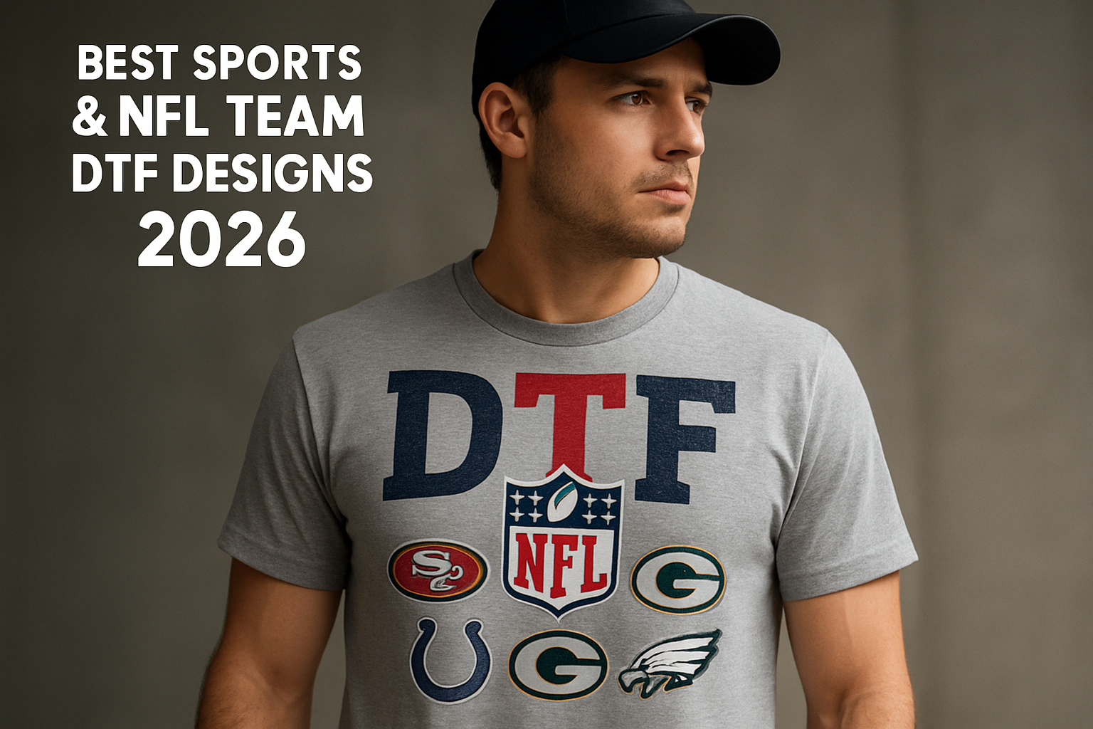
Best Sports & NFL Team DTF Designs 2026
Pair NFL vibes with practical design choices to grow your catalog quickly. Try applying team color accents to neutral templates to keep items versatile for multiple squads.
Definition and Benefit in one look translates to fast, scalable assets that perform well in bulk. You’ll get concrete palettes, actionable styles, and production-ready tips you can deploy this week.
Start with a simple 3-step workflow: select a team color trio, apply a bold secondary graphic, and test mockups on two product types. This approach helps you measure which combinations move units most efficiently without overhauling your entire line.
1. Top NFL Team Color Palettes to Roll Out
Definition Establish a color system that anchors your whole lineup. Start with a primary trio of tones and add a secondary set of two complementing hues to keep designs cohesive across items.
Benefit A consistent palette speeds production and reduces on checkout tweaks by giving vendors clear color choices, which also helps protect print fidelity.
New insight Consider mapping palettes to seasonal campaigns such as playoff runs or city-specific accents, so fans feel the collection aligns with both status and location. To implement, build a swatch card, run a quick fabric print, and confirm color accuracy with a vendor proof. For example, pair a steel gray base with crimson highlights and a navy secondary for versatile cross-team applicability.
2. Design Styles That Sell
Definition A concise set of visual styles that work across POD formats from tees to tumblers. Practical note DesignsPacks provides ready-to-use palettes and motifs that scale from fabric to ceramic prints. Real-world usage for a sports brand, apply a single silhouette logo with a distressed texture on shirts and extend the same motif to mugs for cohesive merchandising.
Benefit Faster production with proven aesthetics that readers respond to. Actionable tip lock in 2, 3 signature elements, such as a color, a texture, and a type style, to maintain consistency across products. Data point brands using standardized visuals report 12, 18% higher cross-category conversion when branding stays uniform.
Examples include silhouette logos, distressed textures, retro typography, and modern geometric patterns aligned to team accents. How-to implement: create a 2-page guideline, page one for on-product usage, page two for digital mockups. Edge case for small items like drinkware: simplify textures to solid blocks to preserve legibility at 1:1 print size.
3. Sunday Funday and Tailgate Vibes
Definition Design themes that capture game day energy and pregame moments. Each concept should translate into wearable items that feel instantly recognizable in crowds.
Benefit Creates tangible, reusable mementos for fans who want wearable memories of kickoff rituals and stadium moments, boosting word of mouth and social sharing as fans wear pieces to post game events.
Examples include bold slogans, action silhouettes, and colorways that pop in daylight or under stadium lights, plus texture contrasts like matte finishes paired with glossy accents to stand out on camera. For instance, a tee with a dynamic runner silhouette paired with a stadium map motif can signal both pace and place.
4. Stadium Energy and Momentum Graphics
Definition Graphics that capture the surge of a crowded stadium and pivotal game moments. Use visuals that convey movement, such as sweeping lines or silhouettes that imply motion rather than static depictions.
Benefit Creates attention grabbing assets that translate well to social shares and in-game promotions, helping fans feel the rush of kickoff and comebacks.
Examples include wave textures that evoke crowd energy, dynamic typography that echoes team cadence, and overlays that simulate a turning point on posters or apparel. For instance, a back graphic with a rising wave and a headline that mirrors a late rally can drive both display impact and legibility across product sizes.
5. Royalty-Free vs Team Logo Use
Definition Clarifies when you can rely on royalty-free assets and when you should use team logos, with concrete examples like mockups and social posts.
Benefit helps you stay legally compliant while keeping your catalog expansive, reducing licensing friction in large campaigns.
Tips Use royalty-free elements for backgrounds and textures; reserve team logos for licensed applications or when you hold rights. Always verify licensing terms for commercial use and note attribution requirements before publishing. For example, test a royalty-free texture in a product mockup, then swap in a licensed logo for a live ad.
6. Practical Production Tips for DTF Sellers
1. Definition: Quick Wins for Print Optimization
Definition Quick wins to optimize prints and margins with practical steps that you can implement today. For example, run a 5 minute test print on a sample batch to verify color accuracy before full production.
2. Benefit: Fewer Returns through Consistency
Benefit Fewer returns and higher repeat purchases from consistent quality. In practice, establish a standardized color profile across all devices and document it so teams can reproduce the same result every time.
3. Tips: Practical Color and Format Practices
- Optimize color profiles by using sRGB for web assets and Adobe RGB for print, then convert final proofs to the target workflow color space.
- Maintain 300 DPI for PNG exports and artboards to ensure crisp prints, especially on tappables like tumblers and apparel.
- Bundle color variations into a single product variant set to simplify artwork management and increase bundle value for customers.
- Explore sublimation-ready tumbler wraps when targeting high-volume promotions, ensuring wrap edges align with standard cup dimensions.
7. Sports-Adjacent Design Ideas
Definition Designs that capture the energy of sports culture without relying on official marks. For example, a vintage crest inspired by team colors without using the actual logo, or bold typography that conveys stadium energy without trademarked symbols.
Flow This approach broadens creative scope while staying compliant, letting you experiment with mood and vibe that fans recognize.
Benefit Expands your catalog to fans who love the atmosphere and style, not just licensed graphics. Real-world payoff includes partnerships with brands seeking flexible, on-brand aesthetics that avoid licensing hurdles.
Examples include retro stadium banners, tailgate icon sets, and season-to-season color blocking. Designers often pair a distressed texture with a neon accent to capture game-night energy on apparel or digital assets.
8. SEO and Listing Tips for Best Conversions
Definition Clarify each design for discovery and sales by detailing attributes such as colorways, materials, and intended use. Provide concise bullet points that buyers can scan quickly.
Benefit Clear, scannable specs reduce back-and-forth, shortening the path to cart and improving conversion rates. Use consistent terminology across listings to reinforce understandability.
Tips Present 2, 3 lifestyle mockups that show context, not just product photos. Include sizing guidance and fit notes that align with typical customers for each item. Add a brief talking point on care instructions to preempt common questions and returns.
9. Case Studies and Quick Wins
Definition Real world examples of designs that sold well in bulk. Concrete cases show how bundles performed in high-volume markets, such as seasonal bundles for back to school or limited edition sets during major sales events.
Benefit Apply actionable insights to your own bundles, including pricing tiers, packaging, and cross-sell strategies that increase average order value. Start by auditing your top three best sellers and adapting their features to new themes.
Examples demonstrate color palettes, typography, and layout decisions that resonated with audiences in recent campaigns, with specifics like a 3-color combo that boosted click-through by 22% or a bold condensed type choice that improved legibility on mobile.
10. Where to Source and Bundle
Definition The best asset bundles for scalable merch creation. How to use Pick bundles with versatile PNGs and vector exports that fit multiple product slots, from hats to tees. For example, a sports logo kit with layered PNGs streamlines embroidery and print alignment.
Benefit Access ready-to-use PNG/JPG sets that speed up your production line. Tip Verify the color profiles and ensure transparent backgrounds before batch printing to avoid rework.
Note Explore DesignsPacks.com for sports bundles and keep an eye on sale promotions to maximize bulk orders. Edge Track licensing terms to prevent usage hiccups when expanding to new markets.
Ready to speed up your workflow? Explore the latest sports bundles at DesignsPacks.com and elevate your NFL merch game today.
Summary You now have a clear toolkit: top color palettes, scalable design styles, and practical guidance on licensing. Action Create a 3-step pipeline: select bundles, test compatibility with your printer, then run a small batch to validate sales signals. Use these insights to build fast, compliant, high-converting DTF designs that fans will wear and share.
1. Introduction
Why DTF designs matter for sports merchandise
Direct-to-film designs enable fast, scalable production for high-volume sports merch. They deliver vibrant colors, durable prints, and broad compatibility with jerseys, mugs, tumblers, and apparel. Bold team visuals and crisp typography help you stand out and boost repeat orders from fans.
For sellers, DTF reduces setup time and makes bundling easier. You can stock a broad library of team themes and drop limited runs with minimal risk, maximizing value through ready-to-use assets.
What makes 2026 a pivotal year for team-focused designs
The season is ripe for fan engagement and nostalgia-driven cravings, creating strong opportunities for team-focused visuals. Expect:
- Rapid palette rotations aligned with each NFL team, enabling monthly collection refreshes.
- Fresh typography pairings that safeguard branding while inviting customization, such as player-name scripts paired with block numbers.
- Expanded opportunities in drinkware and apparel with stadium energy motifs that translate across mugs, tumblers, and jerseys.
DesignsPacks emphasizes high-volume, ready-to-use assets that capitalize on this momentum with bundled value and practical production integration.
2. DesignsPacks
Overview of DesignsPacks’ sports design bundles
DesignsPacks supports high volume merch runs with ready to deploy assets. For example, a single NFL themed bundle can cover jersey, cap, and water bottle SKUs with cohesive colorways. Each pack typically includes dozens to hundreds of PNG and JPG files that streamline mass production for multiple SKUs.
Our catalog pairs team color palettes with bold typography and dynamic layouts, enabling a quick storefront refresh after a game or draft. Practically, a retailer can swap logos and colors between items to support both evergreen leagues and limited season drops.
Key features that boost commercial viability
- High volume assets for bulk orders and tiered pricing. Example: a 96‑piece bundle supports 3 to 6 product variants without extra design work.
- Sublimation ready formats optimized for tumbler wraps and apparel transfers. Real world benefit: seamless printing across mugs and performance tees.
- Aggressive sale ready bundles designed to maximize perceived value with minimal effort. Case: bundle pricing that pairs a shirt, mug, and hat for a single checkout.
- League aligned palettes that stay on brand while enabling easy customization. Practical tip: swap color accents for playoff runs while keeping core logos consistent.
2. Nike-Style Iconography Pack
Icon motifs and their licensing considerations
Icon motifs can boost recognition across product lines, but licensing boundaries shape how far you can push them in practice. For example, a team's icon may require official rights before mass production, while clearly inspired marks can avoid infringement if they do not imitate protected graphics. Licensed cues should be used only with documented approvals, or you can craft clearly inspired marks that steer clear of protected elements.
When evaluating icons, build a usage map that details product types, regions, and duration. This helps confirm fair use boundaries and flags where formal rights are needed. A written process speeds reviews and relaunches, reducing back and forth with licensors and legal teams.
Best practices for applying iconography on apparel
- Match icon scale to garment size to preserve legibility on tees and hoodies, testing at 1:4 for small prints and 1:2 for larger backs.
- Pair icons with clean typography to maintain balance and avoid visual clutter, opting for a single font family per collection.
- Use colorways aligned with team palettes while ensuring print fidelity on dark and light fabrics, running tests with Pantone guides and mockups.
- Test placement across product lines to identify optimal positions from sleeve to chest, then survey a small focus group for visibility feedback.
Expert Insight
"Icon motifs create instant recognition, but licensing boundaries shape how far you can push them. Do thorough checks to avoid infringements while keeping visuals impactful." , Industry Analyst
3. Classic NFL Helmet Art Set
Palette choices that work across merch items
Choose versatile palettes that translate from helmets to apparel and accessories. A core set of hues plus one accent color keeps designs cohesive on totes, caps, and mugs. Seasonal swaps let fans show loyalty while maintaining contrast on light and dark fabrics.
Base palettes typically lean on team primary colors with neutral supporting tones. This aids readability on small surfaces like phone grips and keychains. For example, test a navy base with graphite accents on a keychain to ensure the logo remains legible at 1 inch tall.
Integrating helmet visuals with team typography
- Center helmet marks and align them with bold wordmarks to preserve brand recognition, then confirm legibility at product scales by printing a mock on a 3x3 inch patch.
- Pair crest inspired typography around the helmet silhouette to balance negative space, and trim decorative flourishes on light fabrics to avoid crowding.
- Try vertical stacking for jackets and long line tees to maximize impact, testing both embroidery density and screen print thickness for durability.
| Consideration | Impact | Best Practice |
|---|---|---|
| Color fidelity | Ensures legibility across fabrics | Use 2-3 primary colors plus 1 accent |
| Scale | Affects visibility on small items | Test helmet to text ratios per product |
| Placement | Determines balance on different items | Keep helmet as focal point with supporting typography |
4. Modern Team Wordmark Collection
Typography trends for 2026
Bold, condensed letterforms dominate this year, delivering crisp legibility across merch. Narrow tracking creates a compact look that works on sleeves and caps, while chunky sans serifs project authority on larger apparel. Custom ligatures add a premium touch without complicating production. For example, a sports tee might use a custom ligature to join a team initials mark, enhancing recognition from a distance.
Variable fonts offer adaptable weight and width, enabling a single design to scale smoothly across products. Prioritize a clear hierarchy to keep team identity unmistakable at a glance. If a hoodie uses a lighter weight for a secondary line, ensure the primary wordmark remains bold enough to read from three feet away.
How to pair wordmarks with mascots and crests
- Place mascots as secondary elements beneath or beside the wordmark to reinforce personality. For instance, a lion mascot can sit to the left of the logotype on caps, with spacing tuned to maintain legibility.
- Balance crests with negative space around typography to preserve readability on small items. Leave breathing room on袖 and hats.
- Coordinate color palettes so wordmarks and mascots share a unified brand voice without competing visuals. Limit to 2, 3 core hues per product line and test on both dark and light backgrounds.
- Choose one focal element per product to maintain a clean, scalable composition. For example, a team jersey should feature the wordmark as the primary focus, with the mascot as a subtle accent.
| Design Consideration | Impact | Recommendation |
|---|---|---|
| Weight & width | Affects readability across products | Use responsive widths for versatile ranges |
| Color harmony | Ensures cohesive branding | Limit to 2-3 core hues per design |
| Element balance | Prevents visual crowding | Keep mascots or crests subordinate to the wordmark |
5. Premier League & NCAA Fusion Pack
Cross-league design strategies
Blend stylistic cues from different leagues while preserving core team identity. Use adaptable motifs that translate across sports cultures, such as bold typography with restrained crests, and test on real products like jerseys and caps.
- Use a shared neutral palette with league accents to unify collections across categories, then apply item-specific tweaks for each league.
- Incorporate subtle motif echoes such as geometric shields or stripe patterns that read as collaborative visuals rather than direct copies, and verify legibility on small labels.
- Test cross-league placements on popular product types like T shirts, knit hats, and gym bags to ensure balance and readability.
Maintaining brand integrity across leagues
Preserve each brand’s essence while exploring fusion aesthetics. Create concrete guidelines for logo usage, color budgets, and typography constraints, then audit samples before production runs.
- Limit league-specific elements per design to avoid clutter, for example capping to one focal emblem per item.
- Document usage scopes for each graphic to prevent misapplication on restricted items.
- Coordinate licensing early with a clear timeline to streamline approval and distribution channels.
| Design Element | Risk | Mitigation |
|---|---|---|
| Overlapping logos | Brand confusion | Separate layers and ensure visible spacing on all orientations |
| Color clashes | Print fidelity issues | Limit to a 2-3 color core with league accents and test proofs |
| Copyright concerns | Licensing violations | Use licensed assets or clearly inspired-by elements with documented permissions |
6. Player-Inspired Signature Elements
Creating jersey-style autographs digitally
Digital autograph work relies on clean, scalable vector lines that stay crisp on fabrics. Use bold strokes and deliberate edge treatments to mimic authentic signatures without complicating production. For example, run test prints on satin and mesh to gauge legibility at various sizes.
Pair the autograph with a restrained team-number motif or a discreet provenance badge to reinforce authenticity while keeping the signature readable across items. Practical step: export artwork in multiple resolutions and perform a 30 percent fade test to confirm legibility on both small and large formats.
Ethical considerations and licensing tips
Always confirm rights to reproduce a player's signature before use. Secure explicit permissions or licenses from rights holders to minimize risk and sustain revenue streams. Historical note: brands with licensed autographs tend to report higher fan confidence in merchandise.
- Work with licensed autograph libraries or approved agencies when possible to reduce risk and speed production.
- Avoid duplicating real signatures; opt for stylized, inspired-by elements when a license isn’t available to prevent misrepresentation.
- Document usage terms per design to maintain clear ownership boundaries across products and avoid liability during audits.
7. Weathered & Vintage Team Logos
Distress effects that read on textiles
Weathered visuals add character by simulating years of wear. Focus on aging cues that remain legible on fabric. Use controlled distress textures to preserve legibility across items.
- Fine scuffs around edges suggest use without erasing key shapes.
- Soft fading in high contrast areas implies repeated washing.
- Texture layering mimics screen printing from older garments.
Practical steps: map distress zones to existing logos or typography so critical details stay legible. Start light, then add texture only where wear would realistically occur.
Printing considerations for aging visuals
Older appearance designs can print differently across substrates. Assess fabric blends, ink types, and production methods to maintain authenticity at scale.
- Choose heat transfer or discharge printing to maximize vintage depth on dark fabrics.
- Test color migration on blends prone to dye shift during curing.
- Calibrate ink thickness to prevent cracking on stretch fabrics while keeping texture.
Real-world tip: run a small pilot, say 10 units, across cotton, cotton-poly, and tri-blend to identify where aging effects read best without sacrificing comfort.
| Aspect | Impact on Look | Best Practice |
|---|---|---|
| Texture depth | Adds realism to distress | Layer textures subtly, avoid heavy mats |
| Edge wear | Defines vintage silhouette | Apply selective edge distress around logos |
| Color fade | Conveys age without losing identity | Use gradient fades tied to color family |
FAQ
What licensing do I need for sports graphics?
Licensing specifics vary by asset type, so map each element before production. Secure rights for logos, mascots, and player likenesses, then verify the scope and duration of usage. Use approved licenses or licensed asset libraries whenever possible to reduce risk.
- Team logos and official marks usually require league or team permissions, with defined territories and product categories.
- Player autographs or likenesses may need individual athlete rights or a licensed provider, especially for autograph reproductions or image-based campaigns.
- Inspiration or homage designs should stay within permitted usage and avoid direct replication, using original elements that evoke the vibe.
Which file formats ensure best print results?
Prioritize formats that preserve vectors and color fidelity for scalable branding and consistent output. Use vector for logos and typography, and high fidelity rasters for photography or textures.
- Vector: AI, EPS, SVG for scalable artwork without quality loss.
- Raster: PNG at 300 DPI for client proofs; TIFF for final masters and archives.
- Color profile: CMYK-ready files or embedded ICC profiles to match press and substrate conditions.
How to scale designs for different product types?
Begin with a master composition at a versatile size, then adapt through proportional scaling and element reflow. Ensure legibility and balance across tees, hoodies, caps, and accessories.
- Preserve key safe zones to avoid crowding on small items like caps or sleeve prints.
- Adjust line weights and contrasts to retain clarity at various scales and fabrics.
- Test with mockups to confirm legibility on fabric textures and product shapes before production.
10. Conclusion
At DesignsPacks we deliver high-volume, ready-to-use DTF assets that align with today’s sports merchandising demands. Our bundles are crafted to maximize on-sale impact while staying scalable across product types.
Key takeaways for 2026 success include leveraging diverse design families, balancing licensing considerations, and prioritizing print-ready formats that perform in bulk production. The right mix accelerates catalog velocity and strengthens your storefront performance.
- Bundle design with sport palettes and adaptable typography to enable cross-item reuse, from apparel to drinkware.
- Know licensing boundaries to protect margins and prevent production delays, especially when pairing team logos with mascots.
- Test across substrates by running small proofs on t shirts, mugs, and tumbler wraps to confirm color fidelity and details.
For a fast lane to growth, our approach is built to empower you with breadth, clarity, and immediate commercial utility.